Color Crazy
Claude Monet reportedly said “color is my day-long obsession, joy and torment.” With all due respect, I’d leave out the torment part. My love affair with color is absolute.
Many artists struggle to use color more freely. Not me. Part of the reason I love painting with pastels is they are so robust. I paint on thickly textured paper and if a color doesn’t work, I can try another one right over it. Layering is part of the beauty of the work because different colored pastel crystals refract and reflect light in different ways, making the painting more vibrant.
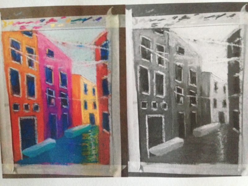
If anything, I often have to resist the urge to use too much color. Every painting needs a focal point, so everything can’t be equally colorful every time. To help, I take a photo of the work in progress, then alter it to see the painting in shades of gray. It quickly becomes clear if the painting needs more variation of light and dark, rather than more bright colors, to make it interesting.
Here’s an example of a Venice painting on my easel now. Comparing the color to the gray version shows too much darkness on the right, dominating the painting. There’s also too little light on the tops of the buildings on the left, and too much on the boats. Now I know what to do to finish the painting!
Thanks, Michelle. As another artist who works with values, in very different ways, you can appreciate the challenge.
Life would be so dull without color. Your study of value before figuring out your color is inspiring. Great work.
Aw – you’re welcome, Sarah. Happy to help! Thanks for reading and commenting.
You color my world. Thanks for the brightness. It lifts my day.