Painting, Drawing and Defunding
Certain words aren’t as clear as they could be, or should be. Defunding, of course, has been in the news recently. Some people understand it to mean abolish the police. The true intent, however, seems to be to focus police on protecting people and solving crimes. Some police funding would be used to allow other professionals to deal with noncriminal activities like truancy, homelessness and mental illness.
While nowhere near as important as the defunding question, drawing versus painting is another example of word confusion. It’s not as annoying as the dreaded word “chalk” (the subject of previous rants, and explained in my website’s Q&A.) However, it does stick in my craw on occasion, so I’m taking this opportunity to clarify.
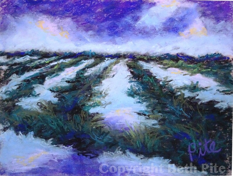
What I do is painting. Using broad strokes and little detail, focused on shapes, color and energy, I create an image using rich sticks of pigment called pastels. Drawing is focused on line, tends to be limited in color, and is often about capturing an accurate likeness. Paintings fill the page; drawings usually do not. If I draw, it is simply to help me understand something to improve a painting. My intent with a painting is never to do a realistic copy, but to capture the energy of a scene and show how it felt to be there.
This new painting of marshes near the D-Day beaches in Normandy is an example. During their occupation of France in WWII, the Nazis flooded these fields to starve the French. On D-Day, 18-year-old Allied soldiers parachuted in, often drowning under the weight of their heavy packs. Luckily, the fight against Fascism and a dictator ended well, but not without great losses – and, hopefully, lessons learned. The overcast weather when we toured D-Day sites, with sun barely peaking through, seemed perfectly suited to this history. That, rather than an accurate rendering, is what I wanted to convey.
Glad you liked my explanation, San – and the painting!
Your explanation of the difference between painting and drawing is perfect. And your painting of Normandy marshes evokes those intended feelings. Goosebumps.
Wow! Thanks for the adding the personal touh, JP! And for the good wishes.
Beautiful, and probably not far from Carl’s landing in WWII. May the blue/purple/violet spectrum of light help fund your painting (drawing) and travel endeavors. xo
Thank you, Sue, for being such an avid reader and fan of my work! I’m glad you enjoyed the post.
As always, I love your posts – and of course adore your paintings, Beth! Thanks for making me think about something in a new way, as your posts usually do!